Fragmenta logo
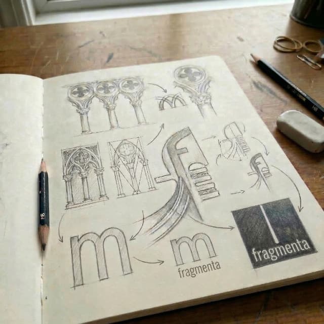
The Fragmenta logo comes from a simple idea: the beauty of the fracture. The vertical line, slightly off-centre, suggests an irregular crack that does not only divide — it reveals. It is not a geometric, perfect separation, but a live fissure, almost accidental. It is the charm of imperfection: ancient surfaces, materials worked by time, fragments that gain character precisely in their incompleteness.
Inside this structure hides a tribute to Venice. The letter f, with its slender profile and its upper part leaning forward, recalls the bow iron (Ferro di prua) of the gondola: the metal comb that guides and balances it on the water. Anyone who knows the city recognises it at once — a sign of elegance, of balance, of craft.
The m, in turn, echoes the mullioned windows of the palaces facing the canals. Its rhythmic openings are those twin windows that mark the Gothic and Renaissance façades of the city, in a continuous dialogue between light and architecture.
In a few strokes, the logo holds two things together: the poetics of the fragment and a reference to Venetian history. It does not merely identify a name. It already opens an imagery made of material, memory and irregular beauty.